Color has been used as an affordance since the dawn of the web, helping hyperlinks stand out with a bold shade of blue. AI data represents a new form of distinct web content, and again color is used to set it apart from content generated by humans.
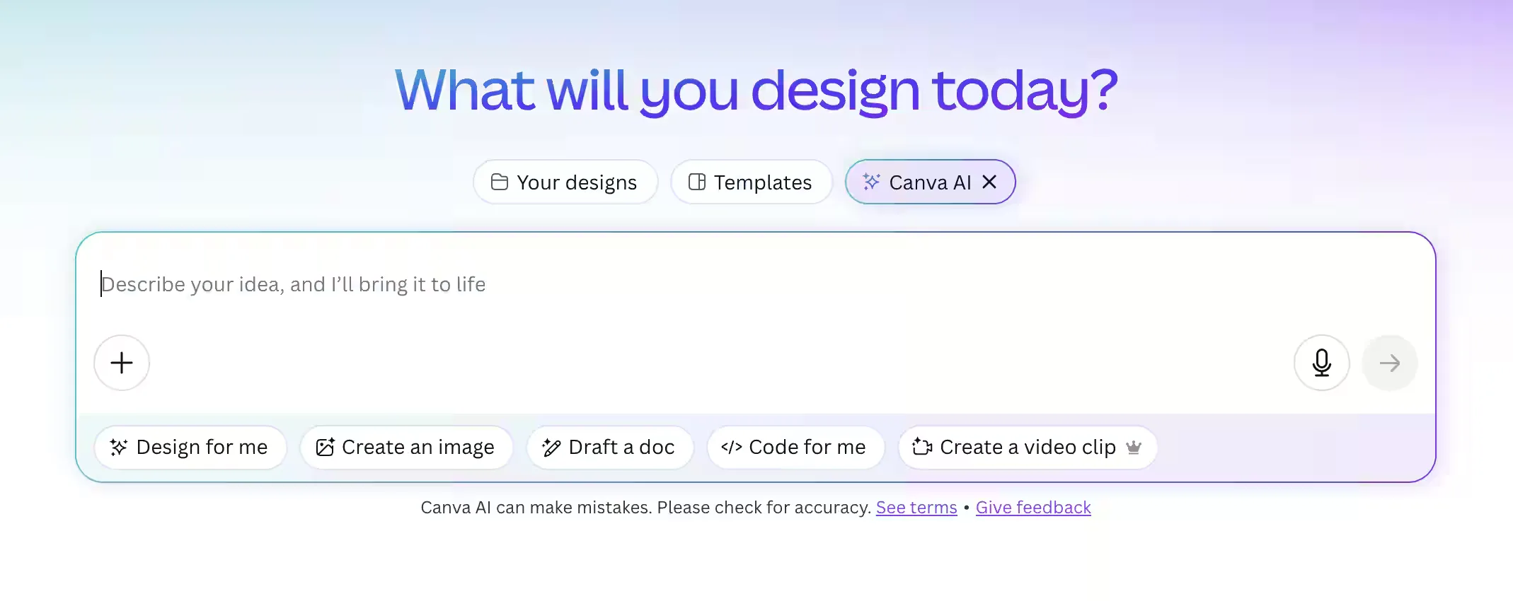
While there are colors and styles that are associated with AI, nothing has been formalized as a web standard. To the extent there is a degree of uniformity, two colors currently stand out: purple and green, with gradients being used in support.
Purple is the most dominant color by far. It is present in a majority of products boasting AI features, which could be the result of many patterns converging at once:
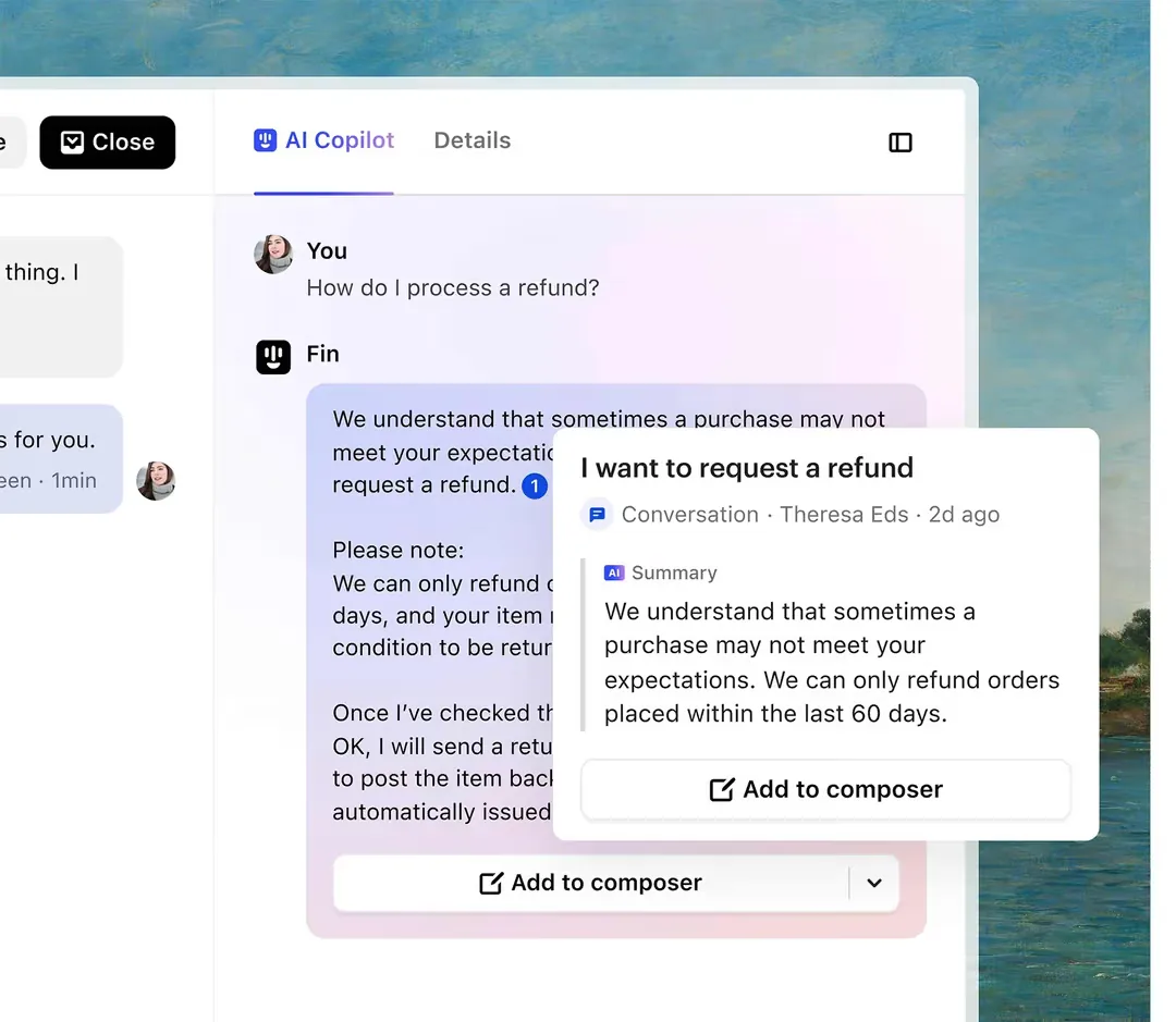
The other common color, green, began as the dominant brand color of ChatGPT, the largest player in the space. Green and purple are also complementary to each other on the color wheel, so the pairing shouldn't be surprising. GitHub has recently adopted a green, purple, blue palette for its AICopilot.
Should you use purple or green, or something else? That's up in the air, and up to you.
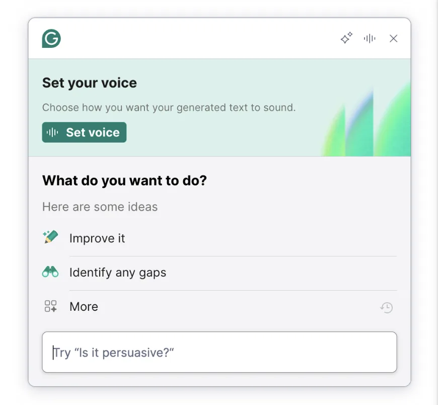
Some companies are opting to rely on iconography over color, extending their brand color to AI applications instead. ReWord is an example of a company marching to the beat of their own drum.
There are some smaller trends emerging related to color. Gradients are used in many sites, though that may have as much to do with an interest in appearing modern as anything else.
Generated UI has taken on a similar visual style: the purple and blue gradient of vibe-coded software is starting to become ubiquitous. This likely had to do with the standard palette of Tailwind CSS.
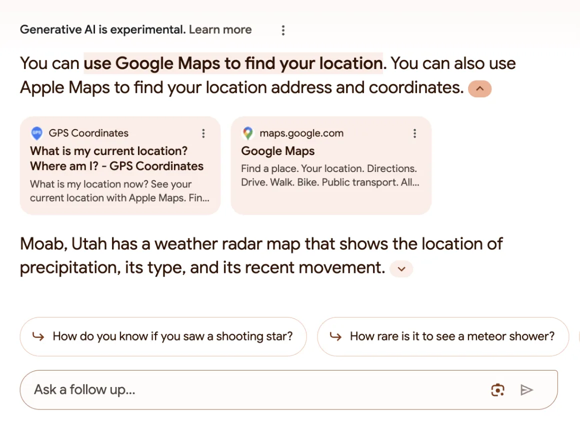
Google uses color in ways that aren’t echoed by other sites as far as I can tell. In their AI-generated search results, conversations alternate between different hues of pastel for each response in the search window. This has the combined benefit of separating conversations from each other while still contrasting with the rest of the search results page.