Icons take the place of text to help users identify actions using familiar and descriptive visuals. When standards don’t exist, icons are less effective, or even harmful, because they increase cognitive load and make it harder for people to onboard, use, and build engagement habits.
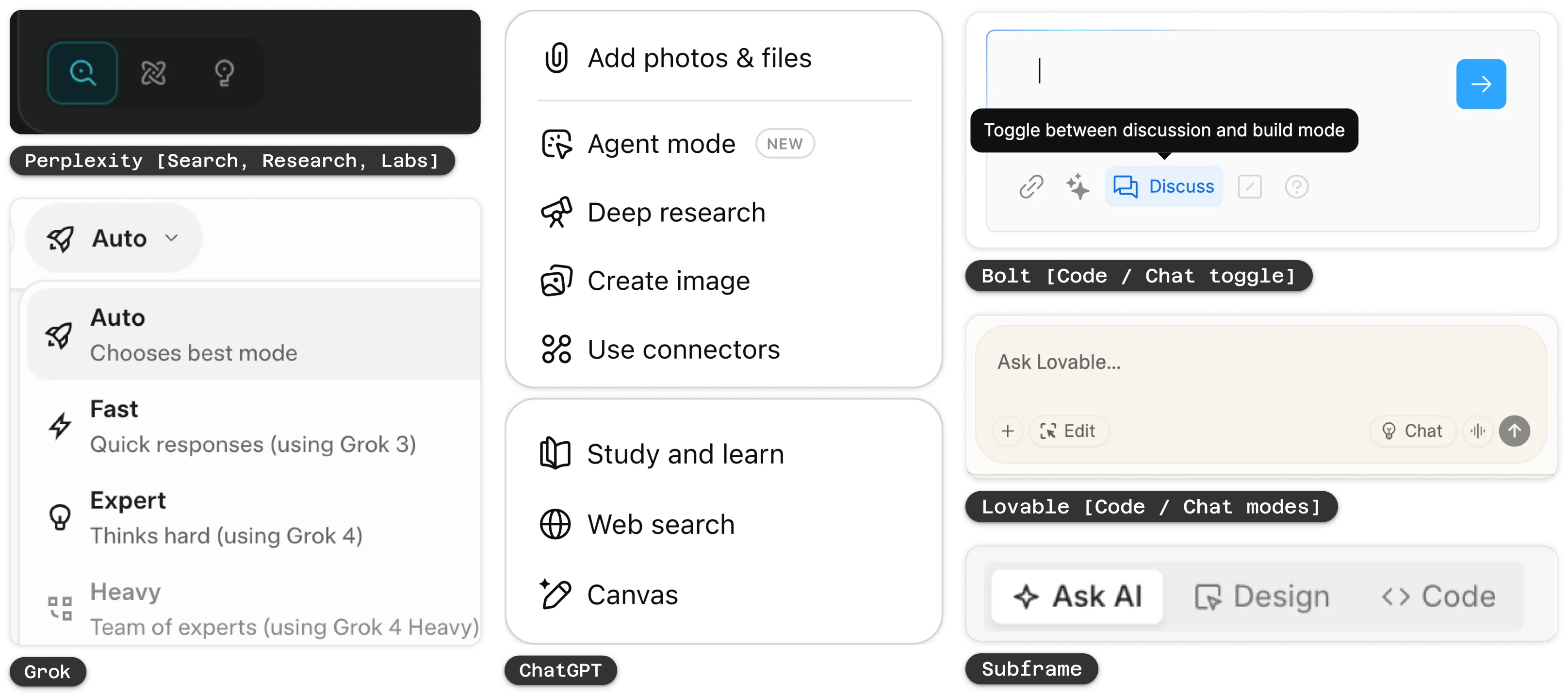
AI products have started to converge around a set of icons that represent its presence. Sparkles, magic wands, and pencils are the most common motifs, though their meaning is not yet consistent.
This loose vocabulary has led to emerging conventions around AI actions:
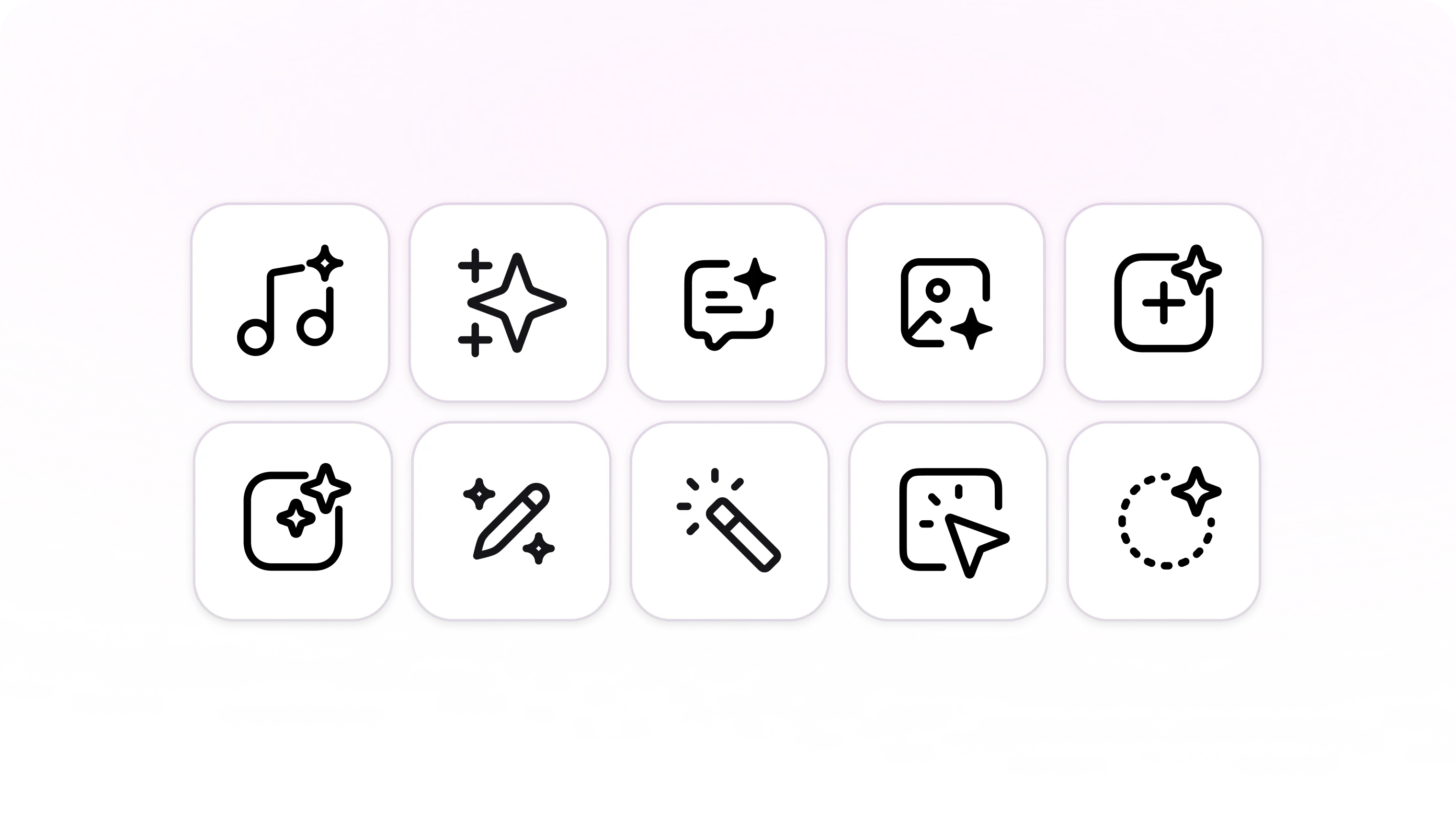
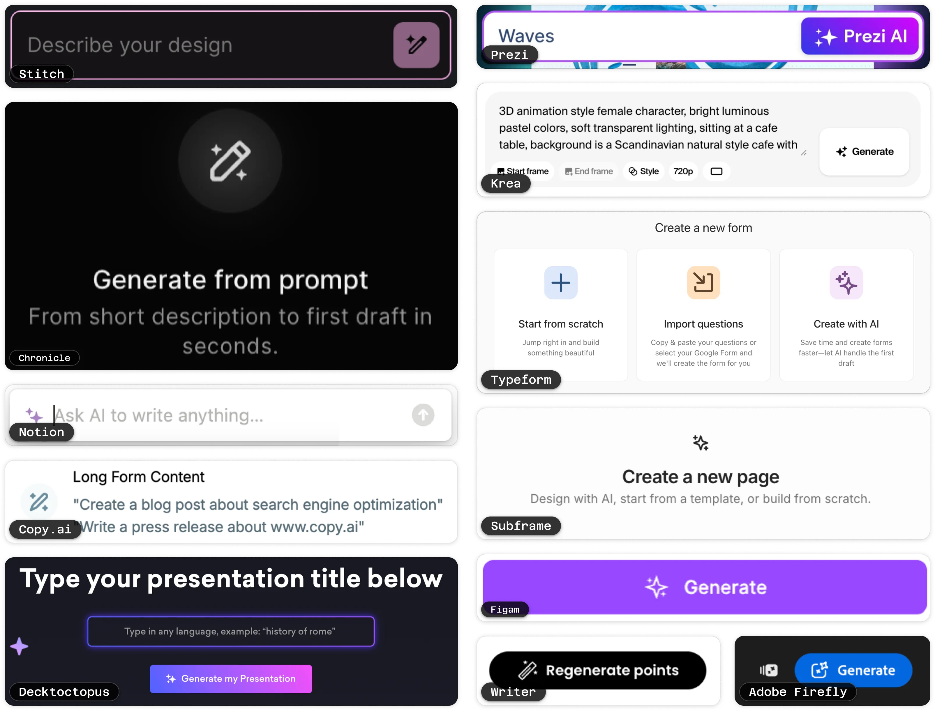
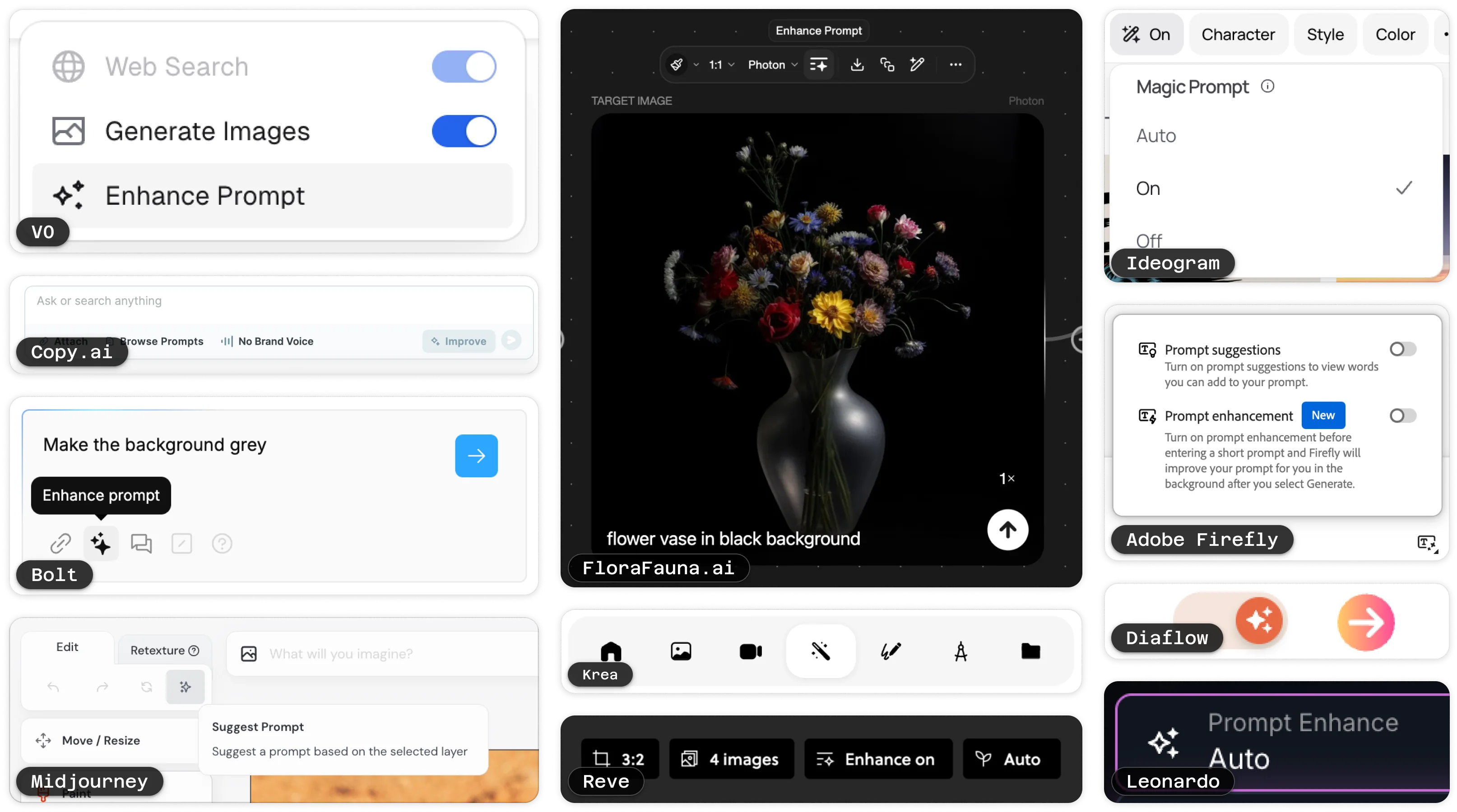
The basis for the initial CTA pattern. This is most commonly signified by the sparkles icon. Given the sparkle’s broad association as a marker of AI, pairing it with inital actions makes sense. Alternatives include magic wands and sparkly pencils. Some tools, like Adobe Firefly, combine sparkles with their own distinct brand icon.
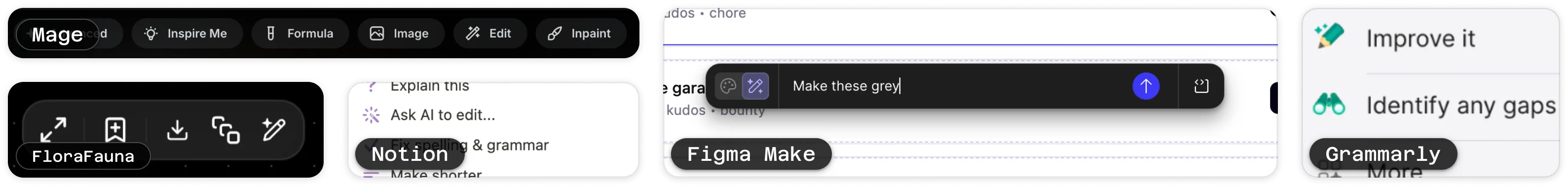
After initial generation or file upload, editing is most often represented by a sparkly pencil, particularly for inline rewrites. Some products still use sparkles alone, but the pencil adds clarity that the action modifies rather than creates.
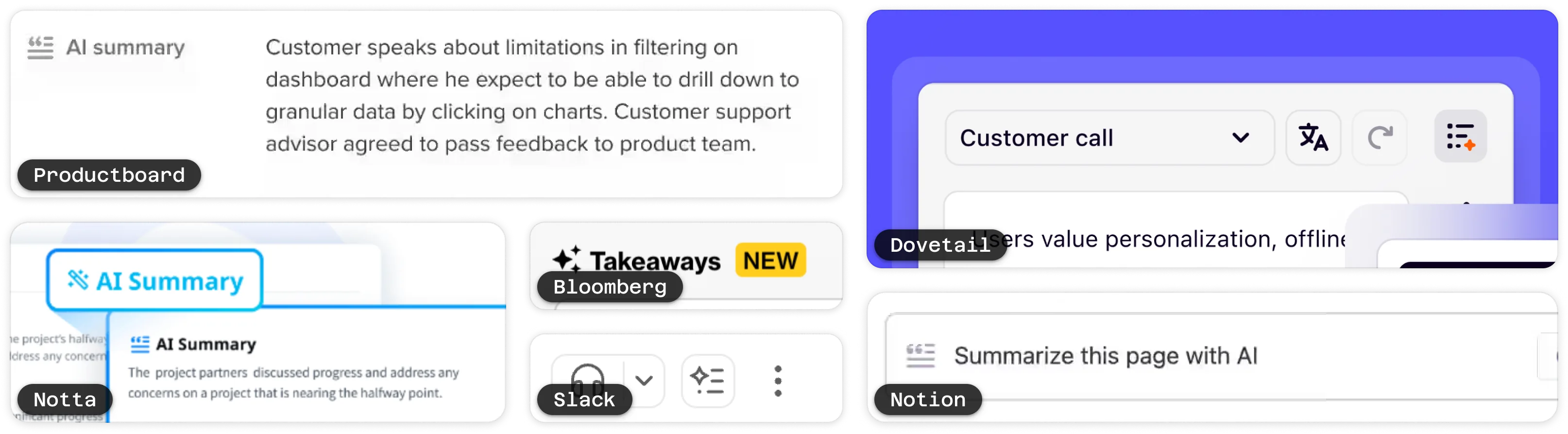
Summarization is increasingly represented with a text paragraph or quote symbol combined with sparkles. This visually differentiates it from “generate,” while still signaling AI assistance.
Enhancement actions (e.g., “improve prompt,” “refine output”) are often paired with sparkles or icons showing a paragraph with a sparkle. These reinforce the idea of upgrading something that already exists.
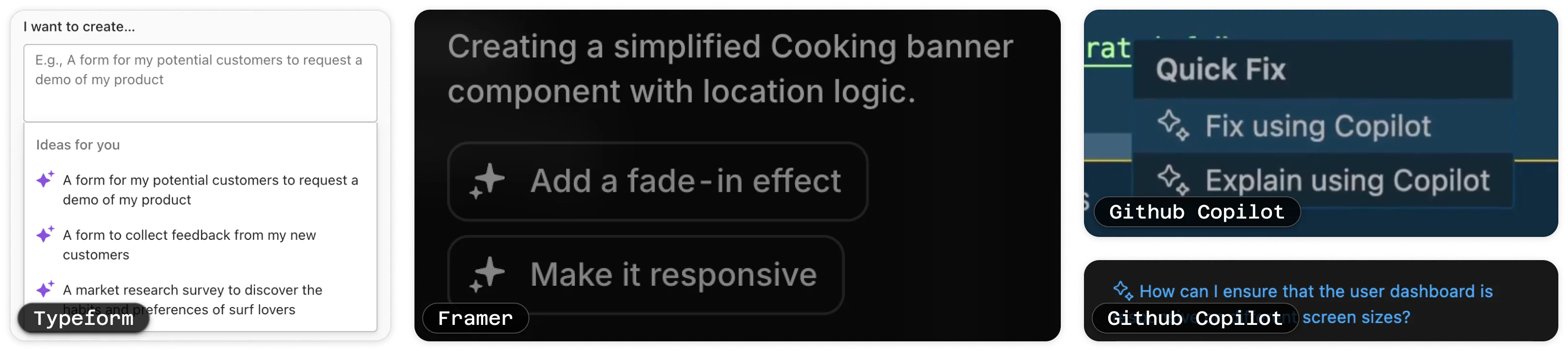
When suggestions feature an icon, they commonly use a two-star icon. This maintains the connection between “suggest” and “generate” while making better use of the small, inline space.
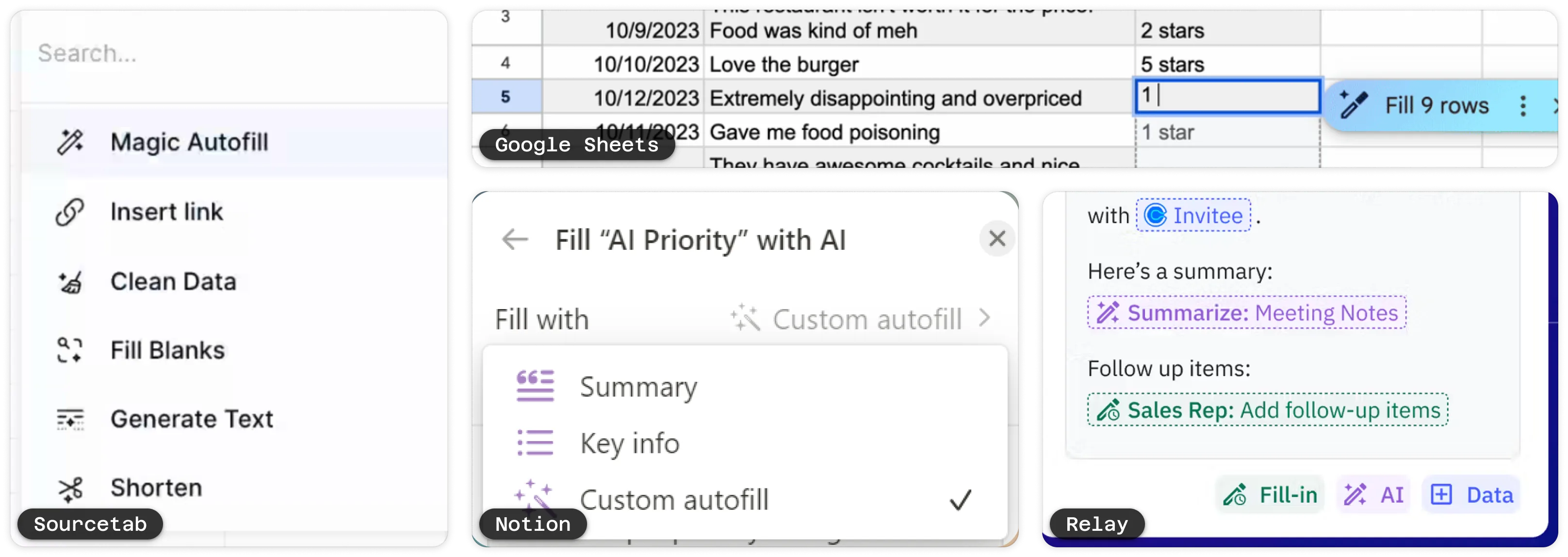
Auto fill in tabular or workflow contexts is often paired with a magic wand, signaling that multiple fields will be handled at once.
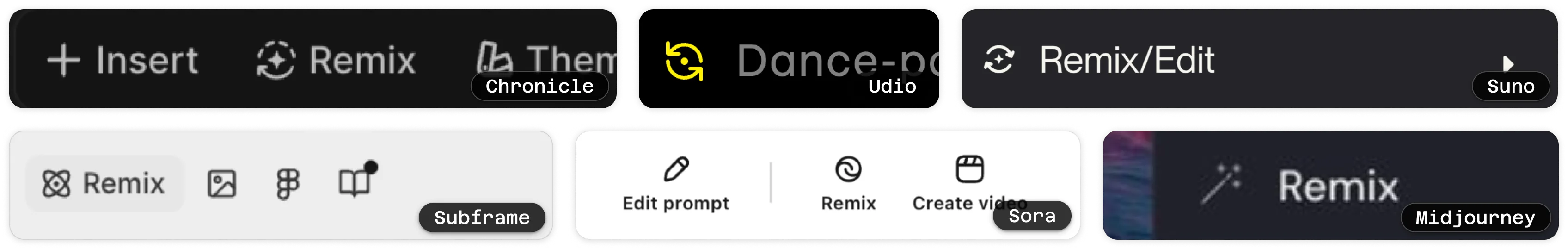
These actions are often represented with looped arrows, sometimes combined with sparkles, to show transformation of an existing artifact into a new style or variation.
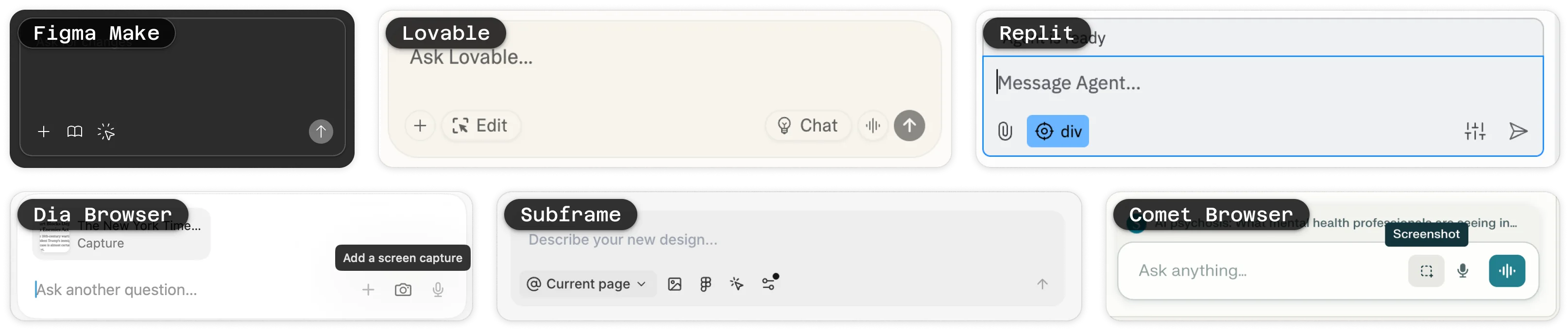
Allows the user to select or reference what they see on the screen and direct AI's attention to it. These actions borrow from IDE pointer metaphors. No dominant convention has yet emerged.
Product modes (e.g., “fast,” “detailed,” “creative”) are typically tied to brand-specific iconography rather than a common standard.