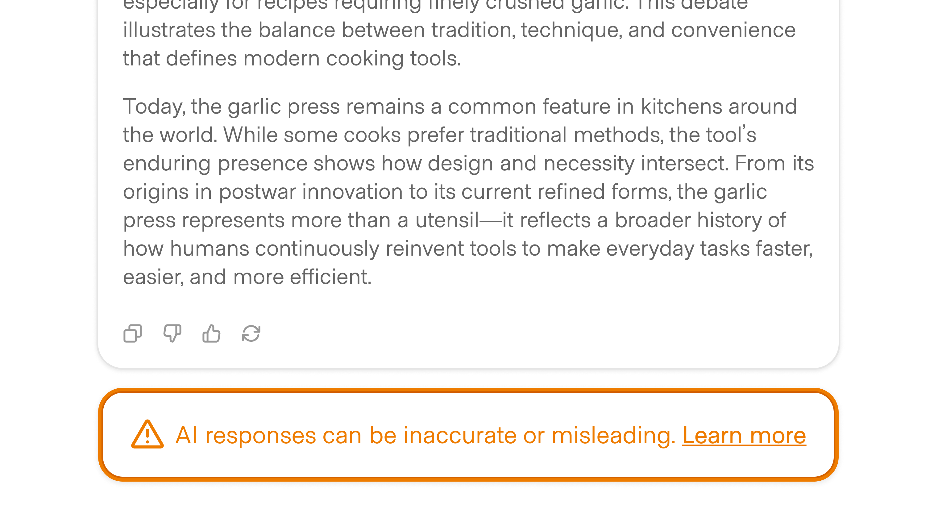
Caveats remind users that an AI system may be wrong, incomplete, or biased. Critically, though this pattern is nearly ubiquitous, it remains to be seen how effective this pattern is at building habits of skepticism and critical thinking when users interact with the AI.
You've likely seen caveats, most often placed just below an open input in conversational surfaces, but this is not the only location where they may be appropriate:
In enterprise contexts, administrators may enforce stricter or more visible caveats across workspaces.
Caveats can be helpful: For less technical users, they are simple ways to signal limitations to the product. In that regard, it’s not much different than a warning label on your hair dryer telling you not to use it in the bath.
At the same time, AI models are complex and rapidly evolving, and caveats are unlikely to be sufficient to encourage and guide users through the nuances of these models.
Furthermore, we should question whether users are already blind to this pattern given its ubiquity. Similar to the standard UX pattern of requiring that users opt into terms of service before signing up for a product, should we believe that users critically understand why a caveat exists and what it means?
Consider going a step further to help users understand and get better outcomes from the model instead of relying on caveats as a fallback. Use wayfinders to guide them to create better prompts, use references and citations to help them understand how the AI derived its response, and make your AI more transparent so users can understand what is happening behind the scenes.